Paper Replication: Principles of Principal Components
Based off Salomon Brother’s 2000 paper which showed how PCA on the yield curve can be used to weigh curve-neutral butterfly trades (theoretically) free of level and slope directional bias. I replicate the (no longer stationary, of course) PCA-weighted butterfly spreads on treasury yields from 2012-2022 in Python. ⚖️
Being quite clueless on bonds and rates, I picked up Siddharta Jha’s Interest Rates Markets, and read through selected chapters. I also read Gregory Gundersen’s excellent article on PCA.
The paper is divided into three parts: explaining how PCA on the yield curve works, using PCs to construct a replicating portfolio, and using PCs as weights for butterfly trades. I focus on the first & third parts.
Here is the Github repo & code.
PCA to model the yield curve
The first part of the paper explains how PCA quantifies yield curve reshaping. The first 3 PCs correspond to level, slope and curvature respectively. PCA performs eigendecomposition on the covariance matrix:
\[\mathbf{X}^T\mathbf{X} = \mathbf{Q}\mathbf{\Lambda}\mathbf{Q}^T\]Where $\textbf{X}$ is the demeaned matrix (column-wise) where the columns are the tenors (e.g 1Y, 3Y .. 30Y) and rows are the daily yields. I used the official Daily Treasury Par Yield Curve Rates data. Since the covariance matrix is symmetric & real, eigenvectors are orthogonal & PCs are independent.
The authors used 120 data points along the yield curve (interpolated at 90-day intervals with a cubic spline). We did so as well and performed PCA on our entire dataset. Each PC is a vector in feature space - an eigenvector of the covariance matrix. We replicate this plot and note the first 3 PCs capture 77.2%, 21.1%, 1.2% of variance respectively.
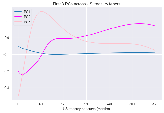
PC1 is level, PC2 is slope, and PC3 is curvature. To link each PCA to the correct movement: note the sign - the first PC (level) never changes sign. The second (slope) changes sign once, and third (curvature) changes sign twice. Projecting our yields in PC space is simply $\textbf{X}\textbf{Q}_{[1,2,3]}=\textbf{P}$, where $\textbf{Q}$ is our truncated eigenvector/PC matrix.
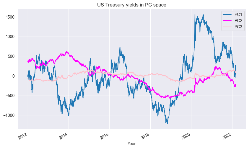
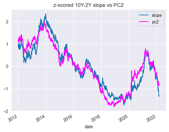
We can reexpress our yield curve data in PC space as shown above. Furthemore, if we plot the z-scored the 10Y-2Y spread (slope proxy) against PC2, we can see it closely matches the slope.
Now we can plot yields over time:
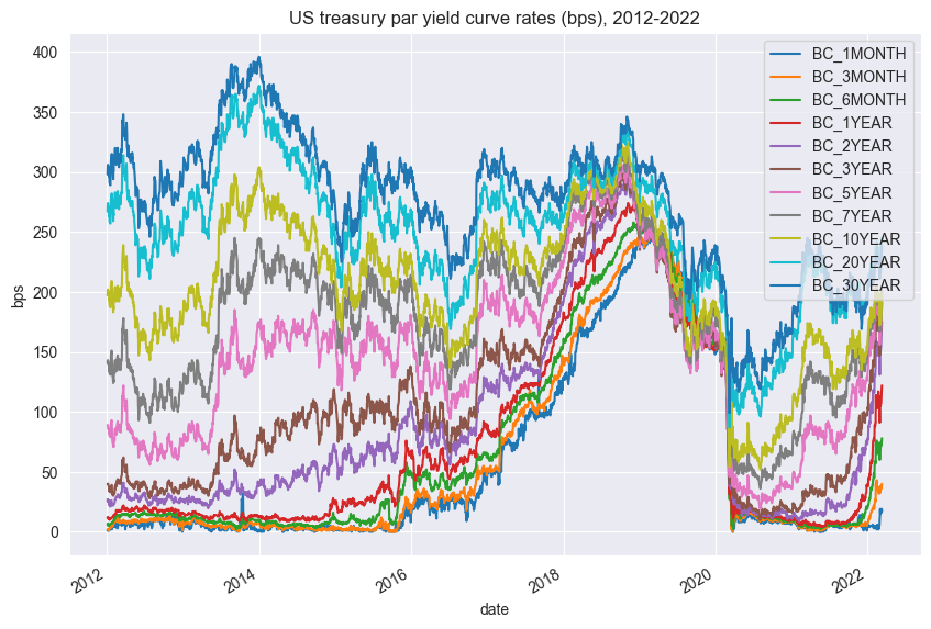
Note flattening of the curve from 2014-2019 and a sharp drop in yield across all tenors in 2020 due to Covid and aggressive Fed rate cuts. If we go back to our PCs over time plot, we can see from 2014-2019 how PC2 dipped and how PC1 skyrocketed in 2019-2021.
PCA for Butterfly Trades
Relative Value Trades
Having established a link between PCs and yield curve movements, we turn to the third part of the paper. An investor can express a view on relative performance via a multi-legged trade. A butterfly is a 3-legged trade consisting of 3 securities of increasing tenors. In a butterfly, the investor takes a view on curvature. An example is a 2s-5s-10s trade: the 2Y and 10Y treasuries form the wings, and the 5Y forms the belly.
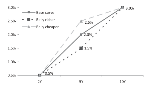
If an investor expect curvature to hump more, he expects the belly (5s) yields go up and wing (2s, 10s) yields go down, thus one is short the belly and long the wings. However, weights for each leg must be determined.
PCAs as Weights
The authors use the 3rd PC loadings as weights for the trade - in theory these are uncorrelated to market or slope changes, creating a butterfly based off pure curvature.
The paper states the trading signals are obtained from the percentiles of the (PC-weighted) butterfly spread over a rolling window of a specified length (2Y, 3Y, 4Y). When the spread hits a certain upper level, they long the rich belly (short the cheap wings), and vice versa.
More importantly, they plotted some charts to reference:
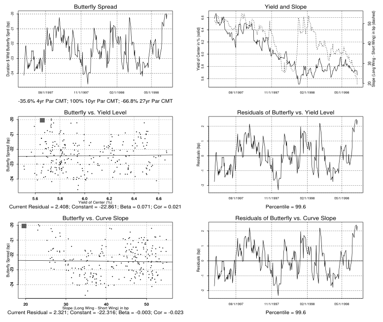
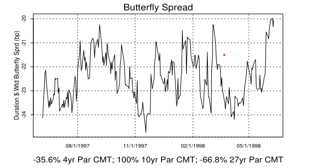
These charts seem confusing, but focus on the left column. In the first row, the image shows a mean-reverting butterfly from the paper: a 4s-10s-27s on yields from 1997 to 1998. The second and third row scatterplots are the butterfly regressed against level (10Y) and slope (4Y-27Y). As you can see, the correlation is close to 0.
For our project, we experiment with different rolling window lengths for the 2s-5s-10s trade from 2017-2022. The code replicates this procedure:
def rolling_pca(yields, n):
    results = []
    for i in range(n, len(yields)):
        window = yields.iloc[i - n:i]
        pca = PCA(n_components=3)
        pca.fit(window)
        results.append(pca.components_[2])

    evolving_third_pc = pd.DataFrame(results, columns=yields.columns, index=yields.iloc[n:,:].index)

def create_butterfly(yields, n, m1, m2, m3, z, ew=False):

    # extract the desired butterfly tenors from yield data
    m1, m2, m3 = str(m1*12), str(m2*12), str(m3*12)
    yields = yields.loc[:,[m1,m2,m3]]

    # compute rolling 3rd PC values
    raw = rolling_pca(yields, n)

    # normalize by belly. Try normal and z-scored weights
    weights = raw.div(raw[m2],axis=0)
    z_weights = weights.sub(weights.rolling(z).mean()).div(weights.rolling(z).std()).iloc[z:].fillna(1)

    # adjust for rolling window
    yields = yields.iloc[n:,:]
    z_yields = yields.iloc[z:,:]

    # compute butterfly spread
    fly = (yields * weights).sum(axis=1)
    z_fly = (z_yields * z_weights).sum(axis=1)

    if ew:
        fly = (yields * np.array([-0.5,1,-0.5])).sum(axis=1)

    return yields, weights, fly, z_yields, z_weights, z_fly
The code above does steps 1 to 3:
- Perform rolling PCA on cov. matrix of selected yields: 2s-5s-10s.
- Extract PC3 loadings and normalize the weights using the belly. E.g if our loadings are
[-0.63, 0.70, -0.32], our weights are[-0.90, 1, -0.46] - Dot product weights with yields to get butterfly spread
- Plot out the fly over time, check if stationary.
- Generate signals/positions and backtest (!)
Regarding point 5, Jha states that weights in a butterfly are usually expressed as risk weights: the DV01 weightings across the trade. They must be converted to notional weights via backing out DV01 to determine how much to trade.
Stefanica writes: $D= \sum^n_{i=1}t_ic_ie^{-yt_i}/B$, where $y$ is yield and $c$ is coupon, and $B$ is price. Modified duration is then $D_{mod}=D/(1+y/n)$. DV01 is then $B*D_{mod}/1e4$.
The paper does not state if the PCA weights are to be treated as risk or notional weights.
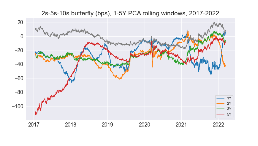
From above, calculating DV01/duration requires historical bond prices/coupon rates which are only accessible with a Bloomberg terminal. Furthermore, the PnL calculation is quite tricky. Hence, I chose not to backtest in the interests of time (and also because I’ve coded up backtests for the past 2 projects). We then plot out the butterfly for 1-5Y rolling PCA weights:
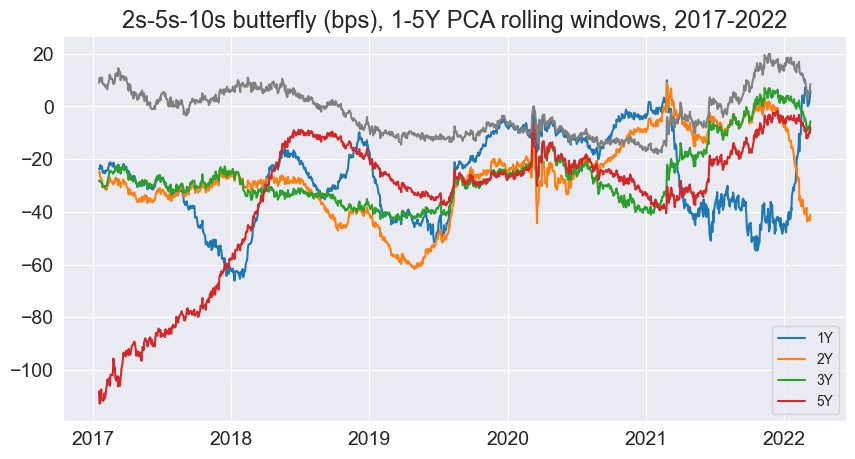
Unfortunately, these spreads are not stationary (contrast this to the paper’s plot above). This means the strategy doesn’t work (neither did I expect it to, 20-30 years later!) This was the paper’s spread over a year:
And here is ours for 2021:
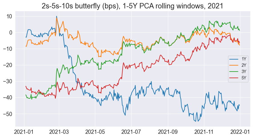
Comparing the two, we see how the butterfly yield for various PCA window lengths across a single year differs in 2021 than in 1998. However, we do notice that the shorter our PCA window, the spread seems to be more mean-reverting, especially over a long horizon. Here is the spread for a 1Y PCA window.
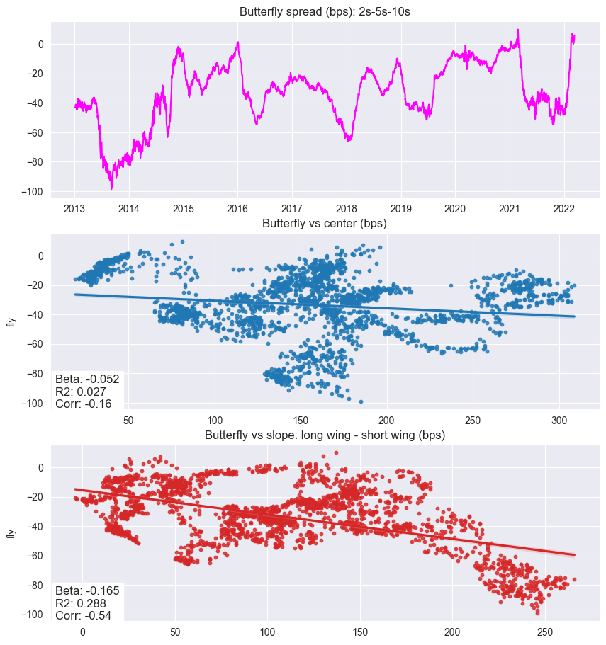
This looks somewhat mean reverting, but only over a very long period, unlike the original paper’s chart (one year). The high correlation coefficients to slope and level are in constrast to the zero to no correlation in the original paper, likely due to the short window. The authors state a choice of window is very important. A long window captures longer term changes in yield curves, but if yield regimes/policies change over time, then we end up using irrelevant information.
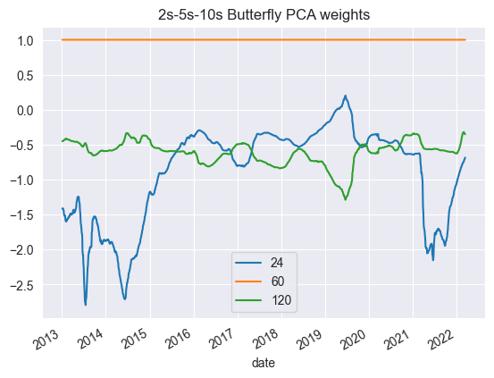
The 1Y PCA rolling window weights look like this:
However, we try an alternative: what if we z-score the current weights (over time) over a rolling window? The resultant weights would look like this.
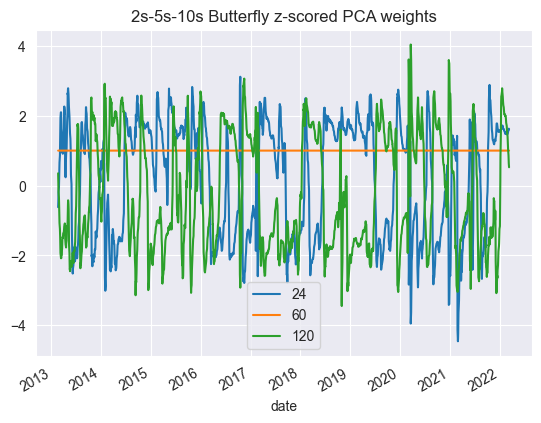
The new “butterfly” spread with z-scored weights then looks quite stationary:
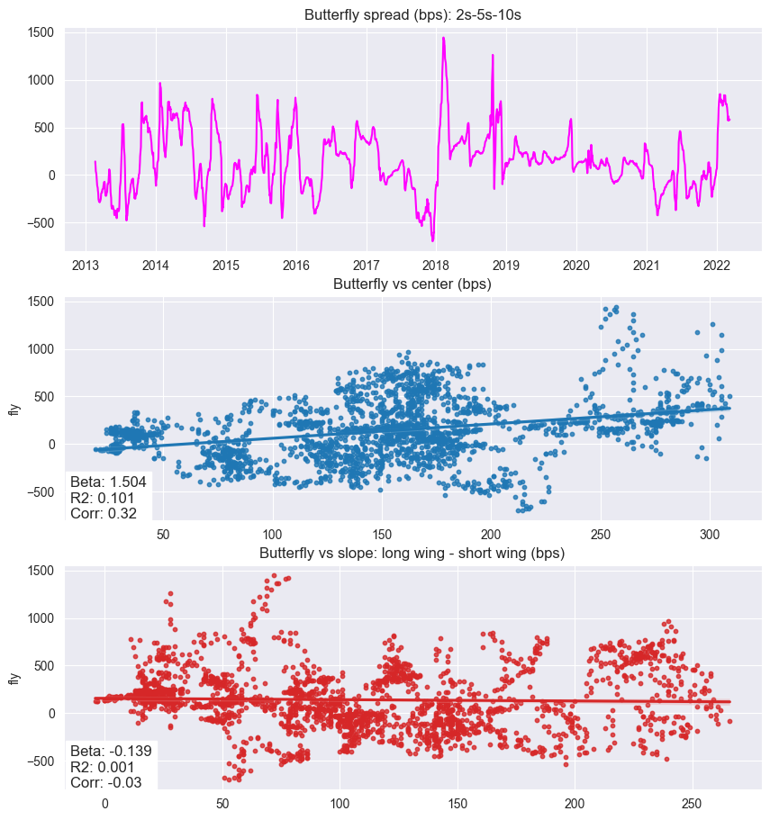
However, these weights are no longer a butterfly, as the signs of the trade are no longer $-, +, -$. Instead, we have $+,+,+$, $-,+,+$ and $+,+,-$. Also, by modifying weights, they are no longer in theory level and slope-neutral. An interesting tweak nonetheless that creates a more stationary spread.
Investigating Non-Stationarity
Given the butterfly spread was mean-reverting back in 1989-1999 (the time period of data the authors backtested their strategy on), somehow ours is not.
Recall, the scatterplots from the original paper showed correlation of the butterfly againt the belly yield and long minus short wing yield as proxies for exposure to level and slope movements, and that the correlation was close to 0 for both for the period of 1997-1998.
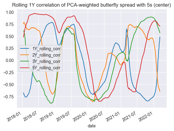
Our correlations seem to fluctate.
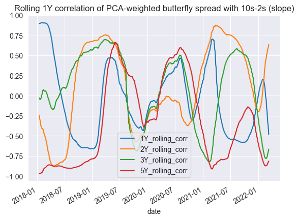
This implies that on modern data, a rolling PCA window butterfly spread is no longer level and slope neutral like in the original paper. The macroeconomic conditions are probably too different from 2012-present as compared to 1989-1999.
Conclusion
In conclusion, this post replicates the butterfly trades aspect of Principles of Principal Components by Salomon Brothers.
It is clear yield curve dynamics are very different now as compared to 20 years ago. As such, the rolling PCA risk weights failed to give us a stationary spread to trade. Nonetheless, this was a significant milestone for me - my first paper replication. From reading up on relevant material (Jha) to understand concepts, to finally digesting the paper, to deciphering how to code out the research and replicating it, I have learnt a great deal about fixed income basics and PCA.