🛢️Understanding Crude & Product Trade Flows: Visualising the BP Review of World Energy
Every year since 1952, BP publishes a report called the BP Statistical Review of World Energy. As of 2022, the custodian is now the Energy Institute, which has taken over BP. In it contains historic data on world energy markets: a facts and figures of the yearly production & consumption of energy and various commodities, from 1960/70 to 2022.
At my past role at General Index, I never had a chance to get a feel of markets, flows and players for oil. What is the geographical distribution of crude, product and gas? Hence, I decided to take the data to produce some charts. From there, I could analyze selected ones, understanding the who, what, where and why of energy.
My goal is to gain intuitive geographical feel of the global energy markets, focusing on crude, product and natural gas. Who are the biggest exporters? Importers? Producers? Consumers? Where and why are the sweet/sour/light/heavy crude regions? What are the (inferred) refinery slates across regions? Where and from who does oil and gas flow from country to country? Can we explain the trade flows we see by understanding the history of crude specs/refinery diets & geography?
The raw data (from BP/Energy Institute) is found here. After much wrangling, I produced charts how I see fit to best explain the data. For each category, we will try and understand what the sequence of events leading up to the story told in the chart. We’ll build up with simple, boring stuff to more exciting, interesting stuff.
Table of Contents
- Table of Contents
- Oil Reserves (MMMbl)
- Oil Production (mbld)
- Oil and Product Consumption (mbld)
- Capacity (mbld)
- Crude and Product Trade Flows (MN TN)
- The Platts Periodic Table and Refinery Specs
- Gas Reserves (TN CMs)
- Gas Production (BN CM Y)
- Gas Consumption (BN CM Y)
- LNG and Pipeline Flows (BN CM Y)
- Conclusion
One ExaJoule, or $10^{18}J$ is equivalent to $174M$ barrels of oil. In 2022, world energy consumption was $604$ ExaJoules. Our first chart tells the story of energy consumption by region from 1960 to 2022. The main story is that APAC has outstripped the growth rates of all other regions which have remained fairly stagnant.

The main driver has been China’s growth and a smaller portion of that, India’s growth. What happened in 2000? According to the Economic History of China, the post AFC China entered the WTO in 2001. As China opened up, it began to fuel export-led growth and rapid industrialization. Taking a look at the top 10 countries:

Lastly, we can break down consuption by oil, gas, coal, nuclear, hydro and other renewables. We see that APAC consumes most of energy from coal, then crude. This implies China has a ton of coal plants to generate power as compared to natural gas - probably implying coal is cheaper.


Oil Reserves (MMMbl)

Interesting or major discoveries were: Gharais field, Saudi Arabia, 1985. Orinico belt, Venezuela 2006. Athabasca oil sands, Canada 1997. Anyway, moving on to more exciting stuff.

Oil Production (mbld)

While the Middle East produces the most crude by far, the story of this chart is clearly the 2010 Shale revolution in the US (brown line). As the story goes, it was technological advancements via fracking and horizontal drilling that let the US access previously inaccessible shale reserves like Eagle Ford shale in the Permian Basin in the Gulf Coast.

I was pretty surprised to learn that China produced more crude than Iran and further solidifies the power of the US as the top producer. Clearly, a country might have reserves, but economic, technological and political factors determine the ability to access and extract them (Kashagan, I’m looking at you!).


Oil and Product Consumption (mbld)

We can see that consumption of liquids is dominated globally by two countries, the US and China. Interestingly, the data means the US produces and consumes the most crude in the world, speaking to it’s geopolitical and economic power.

We can further breakdown consumption of product by category to reveal regional demand preferences.


APAC is big on petchems, and diesel, presumably due to industrialization. NA has huge gasoline appetite, due to the heavy use of gasoline cars. Europe is huge on diesel. When I investigated, I realized this was due to policymaking in the 90s where European governments subsidized diesel, leading to an adoption of diesel cars over gasoline.
Capacity (mbld)
Lastly, we can examine refining capacity. No surprise to see US and China dominate.
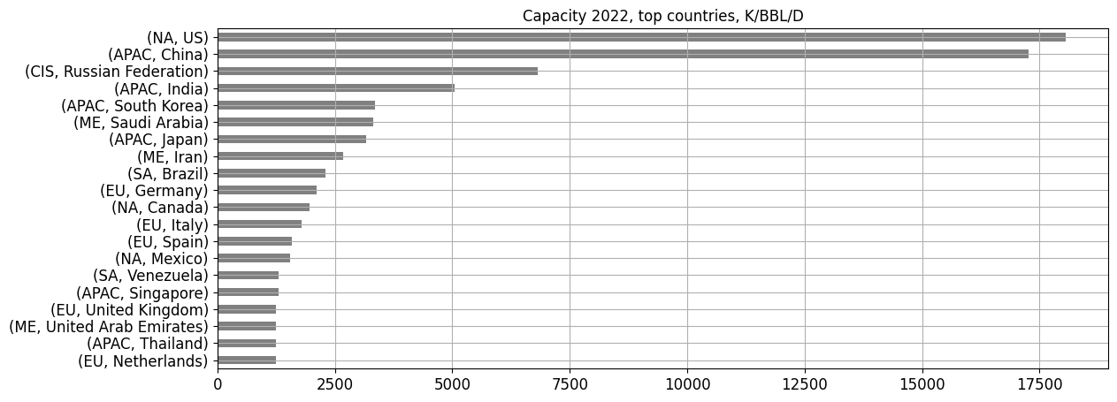
In Asia, China dominates by a large margin followed by India. There is relatively less refining capacity in the Middle East, implying that these countries prefer to focus on producing. In Europe, Germany, Italy and Spain are the top players. Singapore’s heavy investment into refining and it’s status as a bunkering hub in Asia clearly shows. Okay now on to the interesting stuff!
Crude and Product Trade Flows (MN TN)
So, we’ve gotten an idea of energy consumption, crude production, consumption and refining capacity. None of these tell us specifics yet. I wrangled the trade flows data for 2022 and produced a heatmap. There’s alot to be deduced from it. We can look at the export-import flow of each country in detail.
We sort by region and then countries. The colormap is chosen to reflect dark for high flow and light for low flow. To look at where a country exports to, pick a row. To look at where it imports crude from, look at a single column.
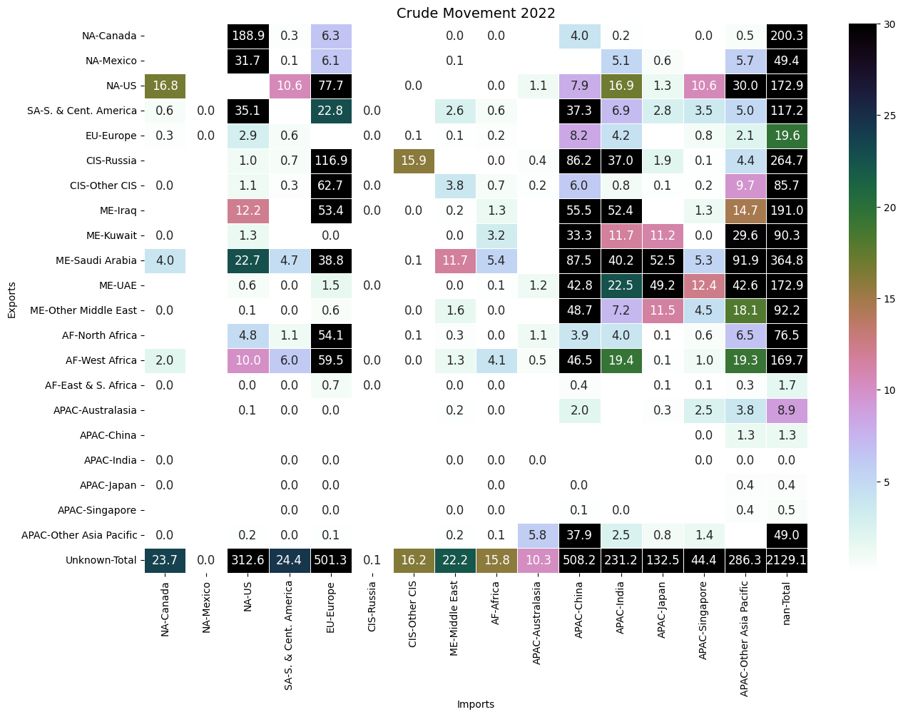
Analyzing the trade flows, we can see the patterns emerge:
- Exports
- Heavy sours from Canada (oil sands), Mexico, South America into the US.
- US exports (presumably light sweet) to neighbours but majority to Europe, and other Asia Pacific (Japan?). Smaller amounts to China and India (presumably distance/grade related?)
- South American crudes are to US, Europe and China.
- Russian and Middle East crude, flow to Europe and APAC. However, with the Ukraine war, exports have reduced since the previous yesterday.
- North and West Africa flows to Europe and APAC
- It’s interesting to see the political impact of the Ukraine war, dependence on Russian crude imports has shrunk since 2021 across the board but still remain significant.
- Imports
- Europe imports from all regions.
- China relies heavily on crude from CIS, SA and ME with minority imports from NA, implying its refineries are not well-equipped to handle light sweet crudes.
- India imports from the same regions as China except for twice as much from the US. My guess that American crudes are geographically far to import to China compared to India, incurring added cost.
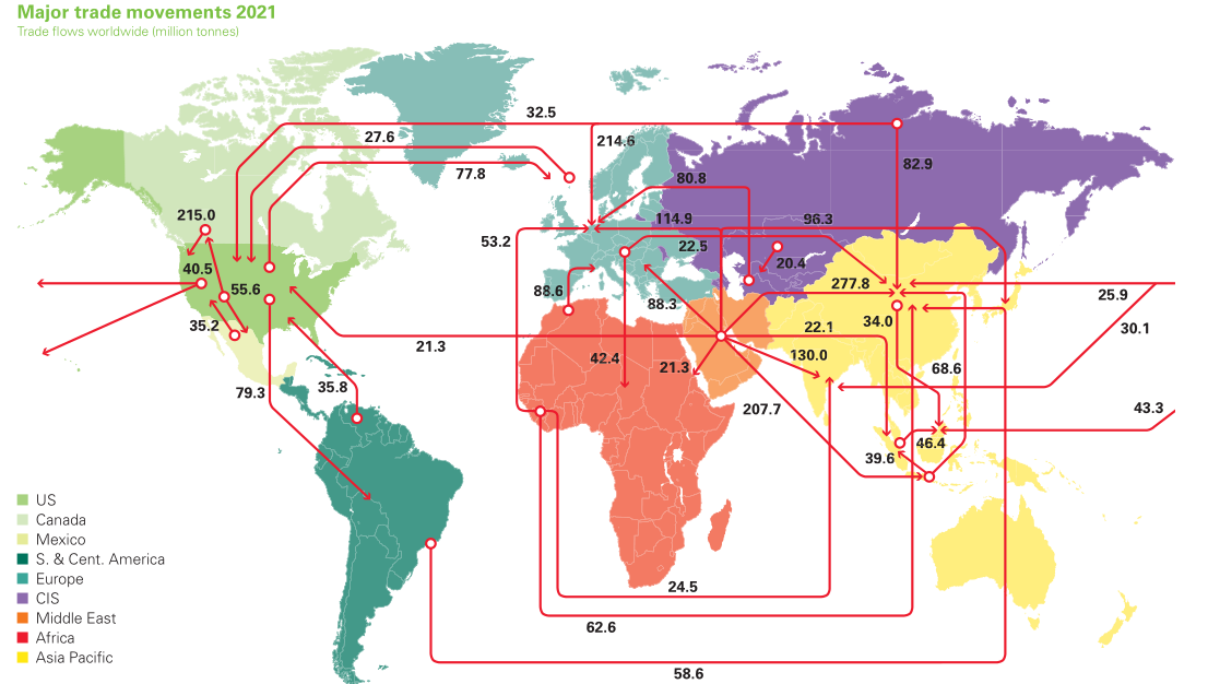
Putting it together, we can see the rough geographic structure of crude flows. The BP map provides more color. We can see the export hubs of Russia and ME and the import hubs of APAC and Europe. The US is special in that it both imports and exports heavily. I sought to understand why this structure was so, so I analyzed the crude characteristics per region, but first, let’s look at the product flows:
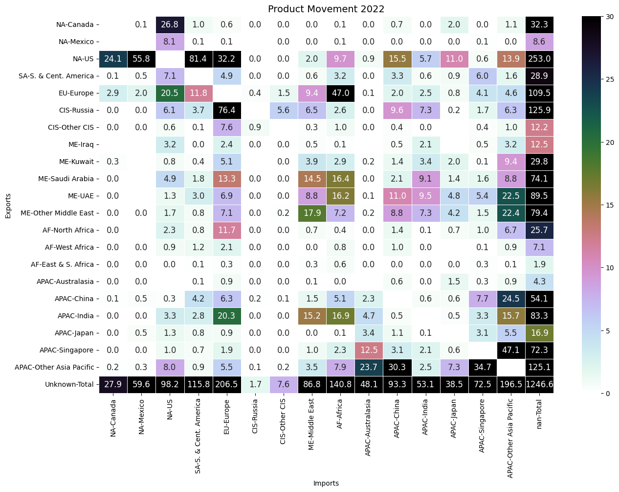
Unfortunately, the data in the report does not show flows by product, so we have to guess:
- Excess gasoline from European refineries who process light sweet flows to meet US consumption while US refineries in turn ship excess diesel to meet heavy demand in Europe due to processing heavier crudes.
- Strong refining capacity means the US imports heavier crudes from SA and ships the product back to them. Why does the US export so much back to central and SA? This would imply refining capacity in SA is insufficient to meet domestic demand, or the product prices are cheaper.
- Other notable product flows are Russian product to Europe and Europe product to Africa (?)
- On the import side, we can notice Singapore being a regional hub in Southeast Asia for refined products, and India being a strong exporter of product - presumably excess refining capacity.
But what accounts for these flows?
The Platts Periodic Table and Refinery Specs
I soon realized the key was to understand the refinery diets and crude characteristics of each region. Platts provides a periodic table of crude grades worldwide. I wanted to visualise this: so I manually scraped the data. Red and blue lines are API gravity thresholds for light (>34) and medium (>25).
Here is the interactive plot to play around with. The markers are scaled by field production levels. Hovering over a grade, we can see the location, specs and production levels. The text indicates grades that are used in a benchmark (e.g WAF, Urals, WTI, Dated Brent).
(Note: plotly doesn’t do very well on smaller viewports so it’s best viewed in desktop)
- African crudes are generally medium-light and sweet with some sour outliers from North Africa. We should expect flows into Europe.
- Asian crudes are medium and sweet in general. Some Chinese crudes tend to be on the heavy side.
- CIS crudes are light and sweet except for the benchmark Russian crude Urals which is medium sour.
- EU crudes are light and sweet.
- ME crudes are generally medium sour.
- SA crudes are sour and heavy.
- NA crudes are generally light and sweet with the exception of Mexican and Canadian oil sand grades.
Referencing the crude trade flows, it’s clear US exports it’s light sweet crude from the shale fields to Europe while taking in heavy Canadian and South American/Mexican crudes. The EIA FAQ states that as of Jan 1 2023, there were 129 operable refineries in the US. Only 7 were built after 2010 (post-shale boom). However, the flow of grades is not specified, but it is safe to conclude the majority of US refineries were not built in mind to process light sweet grades.
Since refineries are complex and difficult to re-configure, processing light and sweet shale oil domestically would mean operating at lower capacities since the distillation columns lighter sections would fill up faster, leaving the heavier sections, and their cracking/coking units to be underutilized and total throughput decreased.
Thus, it’s reasonable to expect Asian refineries, to be geared towards the medium-sour grades from Middle East and possibly Urals from Russia?
Gas Reserves (TN CMs)
Moving on to natural gas, let’s take a look at the countries with the highest gas reserves.
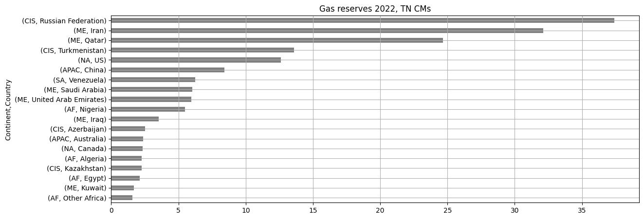
Cool. Russia, Iran and Qatar dominate, followed by Turkmenistan, the US and China.
Gas Production (BN CM Y)
But we already known reserves and production have weak correlation. Let’s look at the top gas producing countries:
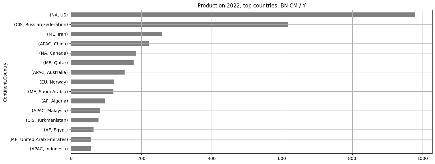
The US dominates every other country by far, with almost 80% more times production than Russia. Then a steep drop off and its between Iran, China, Canada, etc. I didn’t know China produces so much gas. Pretty interesting. There is quite a lot of gas production in Asia.

Now we can see the rapid rise in production from 2000s in the US, CIS and ME to present era.
Gas Consumption (BN CM Y)
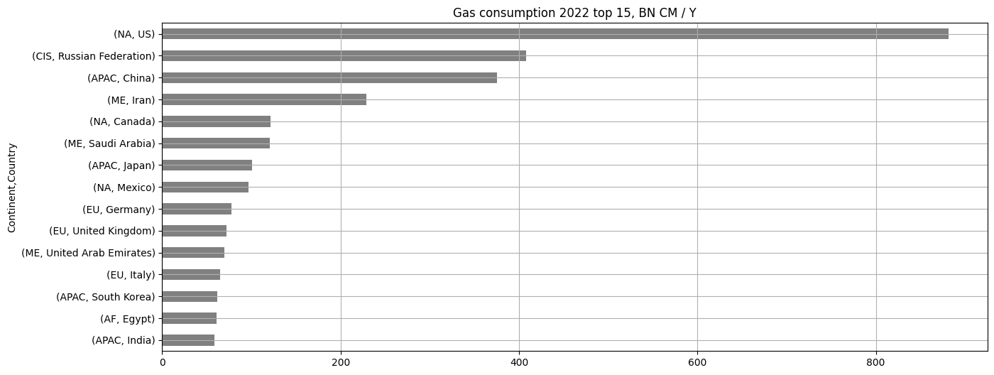
The US consumes more gas than any other country in the world by a large margin. An interesting outlier is Iran. Somehow, Iran really loves natural gas for energy consumption.
LNG and Pipeline Flows (BN CM Y)
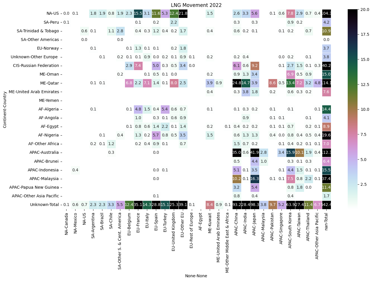
Now for the most informative part: flows. As above, rows are exports, columns are imports, and marginals are at the edges. Lets look at LNG (seaborne) flows first. We notice flows are alot more sparse than crude: meaning less interconnected.
- Exports:
- On the marginals, the US, Qatar and Russia export the most LNG.
- There is a trade flow of LNG cross-atlantic from US to Europe, given the lack of gas fields in Europe.
- Another noticeable flow is out of Qatar/ME, some to EU, but to Asia. So LNG flows West to East: from US to Europe and ME to Asia.
- Imports:
- China gets most of its LNG from Qatar, and some from SEA: Australia and Malaysia, an intra-Asia flow up from SEA into China.
- Japan gets most of its LNG from Australia and Malaysia. Thus we can see another intra-Asian flow up North from SEA into Japan and China.
While the BP report does provide a flowchart, this one seems nicer, albeit in 2020.
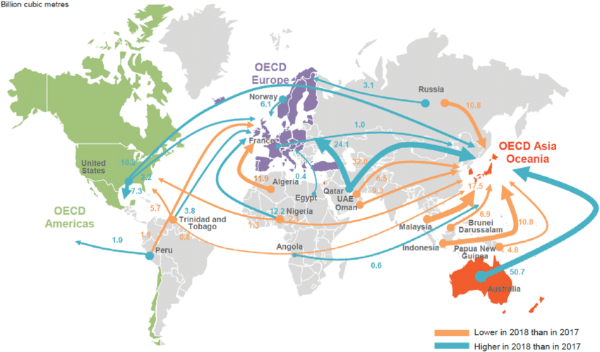
So there are two sinks of LNG: Europe and China/Japan. Waterborne flows come from the US, ME and SEA. Now for pipeline flows:
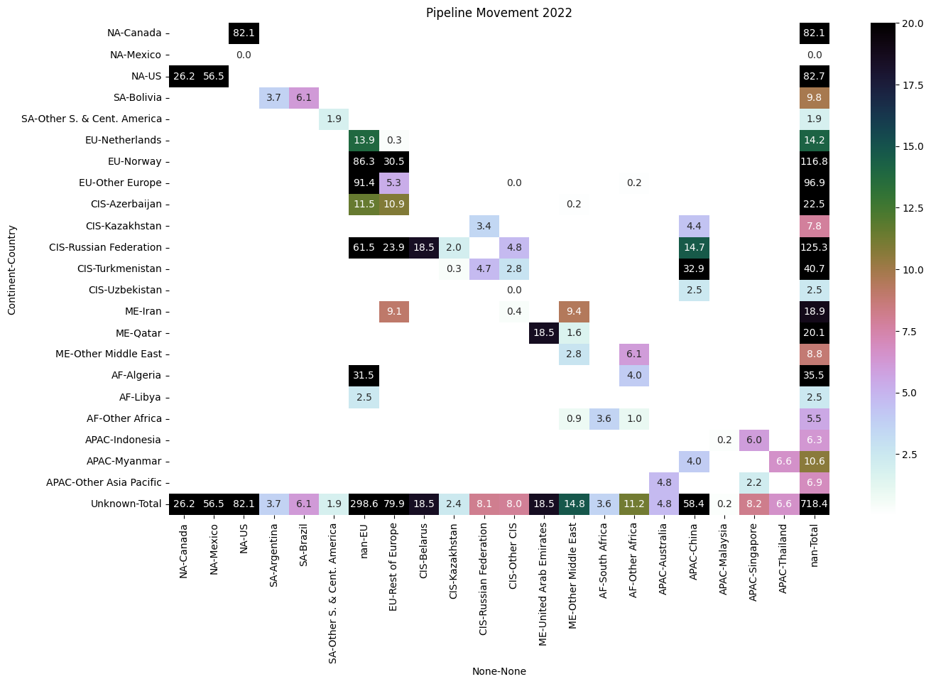
- Exports
- Russian pipeline flows (and Azerbaijan, and Algeria) to Europe, and some to China.
- Norway supplies Europe.
- Imports
- The US exports gas to Mexico and Canada (a small amount) but somehow receives a large import flow (over ~4 times) as much pipeline gas from Canada. This seems confusing, but my guess its to do with geography and pipeline infrastructure along the border.
At this point, I realized data about product trade flows would be much more informative. Unfortunately, the BP report does not have country-to-country trade flows data by product. Which is sad, because I really would have liked to repeat it and see much more nuanced flows.
Conclusion
I still have parsed the natural gas data and plotted charts, but we’ll leave that for another time. To conclude, this post visualises the BP Statistical Review for World Energy charts and the Platts Periodic table of crudes. I’ve got a decent geographic feel of how things flow at a high level.
Edit: As I’ve realized, fundamental flows are available out there from data providers, but are expensive, so we have to resort to scraping tables and charts off a free PDF. Nonetheless, this was a good exercise to get some geographic intuition of crude, distillate and gas flows.